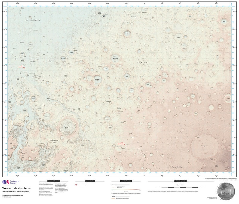
I spent some time this week updating the Maps section of my feed reader, and I was glad to learn that Jonathan Crowe’s Map Room was back on the, ahem, map. Some posts I found interesting: Redrawing the London Tube Map, Mapping Swiss German Dialects1, the Ordnance Survey map of Mars, the 1936 Japanese Rail Network, a map of Paris’ pneumatic tube network and a mention of Around Switzerland in 80 Maps, from my friends at Helvetiq!
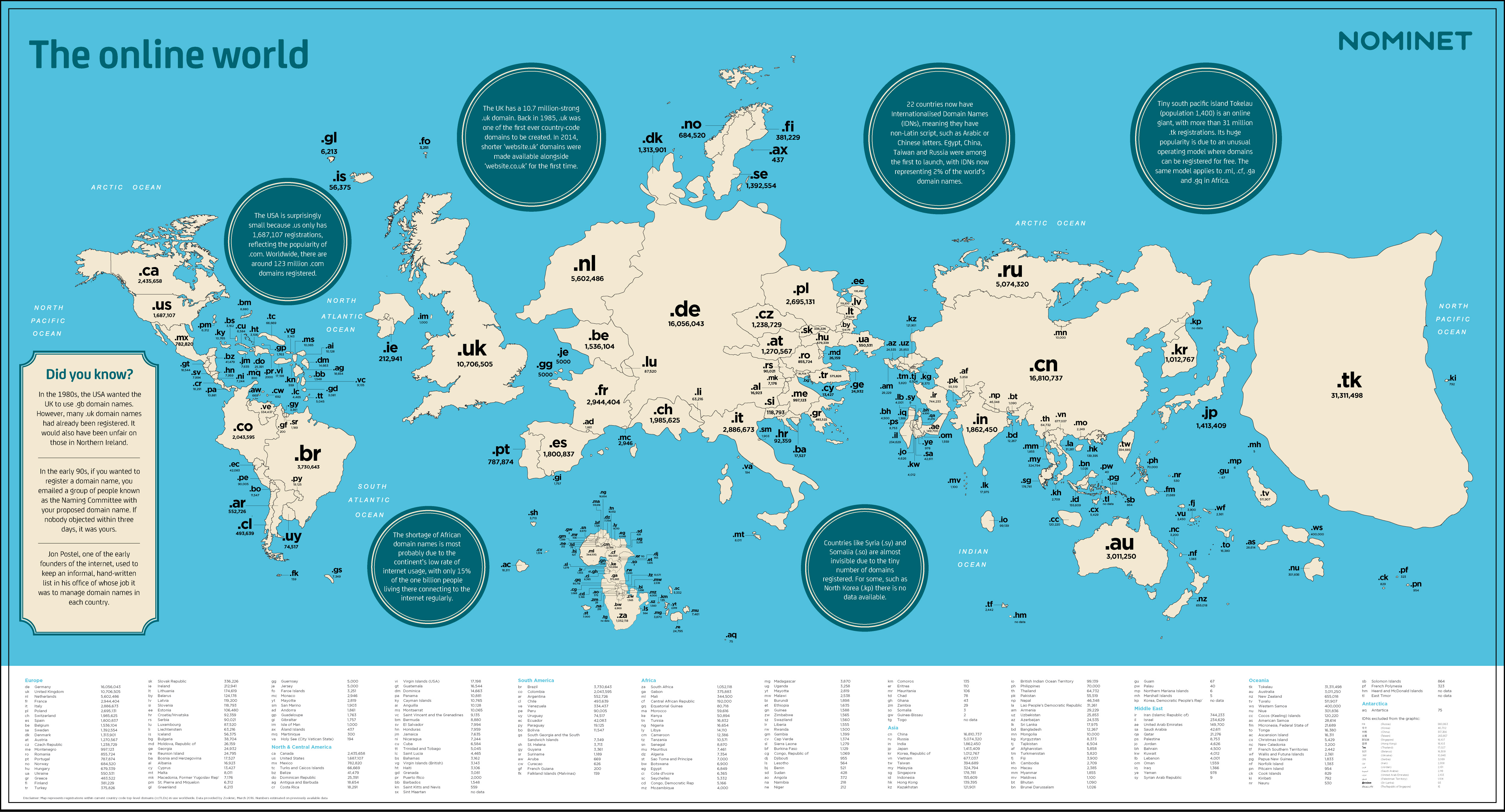
Further down in my inbox was this very interesting map of country TLDs, scaled by popularity, by way of the Strange Maps blog:
Another good feed I subscribe to is Maps Mania, which unfortunately uses Feedburner to syndicate its content, with the result that only the briefest of snippets gets displayed in feed readers. This is not great for capturing the attention of the reader. I’m working on a way to use Huginn to create a nicer-looking feed, but I haven’t cracked the Feedburner nut yet. Anyways, here are a few posts that I found interesting: global flight connections map2, Rorschmaps and other Google Maps API hacks, mapping the word’s most boring (or interesting) roads by calculating how curvy they are, US Census name explorer and the UK surname map3.

This heat map of public transit use in Toronto ties nicely with the everlasting debate on the city’s deficient transit infrastructure and the rampant cronyism that shapes it. It is encouraging to see some areas reach a healthy 50% of the population relying on public transit (which is not bad for a North American city). At the same time, one can’t help but see it as a map of income disparity, with well-connected wealthy neighbourhoods sticking to their cars, while many of those relying on public transit live nowhere near a mass transit line and probably don’t have much of a choice… Related: the Geography of Car Ownership in England and Wales and the visualization of rail station use in the UK.
Zipscribble maps aim to visualize how countries assign postal/zip codes. From the same source, the Travelling Presidential Candidate Map is a variant of the classic travelling salesman problem, computing the shortest path through all US ZIP codes.

Also one of my favourite visualizations from last year: the Isochrone maps of Europe by train. Also let’s not forget the Ultimate Crowdsourced Map of Punny Businesses in America.
Update: How could I have missed the awesome Super Mario style TTC map:
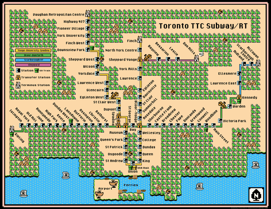
Note that this map already includes the Spadina line’s extension, scheduled to open at the end of 2017. Isn’t it interesting to note that many such fan-fiction versions of the TTC map4 include future or imaginary lines? Cartographic wishful thinking…
Update 2: And here’s a map of the Toronto subway with the approximate walking time between stations5:

- this reminds me of the Chuchichästli-Orakel, which places visitors on a map of Switzerland based on how they pronounce 10 words, with uncanny precision. ↩
- A good candidate for a possible post on travel planning tools, I think. ↩
- Reminding me that I’m still looking for a data source for my idea of trying to map Switzerland’s patronyms by popularity… ↩
- Listing my favourites here would be another idea for a post. ↩
- Ditto ↩