Link dump 2016/8: Open science, books on a ship, waves in the Alps, maker projects

Writing power tools

As I’m in the early stages of my final research project for my studies in Library Science, I’m looking at different ways to organise my thoughts and materials, and taking it as an opportunity to try some of the tools that are defining the current trend towards open and reproducible research. Things like version control can however quickly become complex and might scare away the bravest. It is certainly one of the most challenging topics I’ve had to teach during Software Carpentry workshops. And I’m far from understanding all of it. That’s why this Plain Person’s Guide to Plain Text Social Science looks to be a fantastic resource, laying out a complete workflow using open formats. As far as writing the actual paper, there is still no tool that will replace me. Although it might soon change, as a novel written by a computer almost won a literary price in Japan. The wind-up bird got creative.

Words in transit

I like it when a subway station is being refurbished and traces of the past are briefly brought to light again while walls are being resurfaced. This happened recently on the Paris Métro Trinité station. Together with a glimpse of swanky typefaces and yellowing memories, one learns in passing that this operation in French is called décarrossage.

The Royal Geographical Society recently digitized a series of photographs documenting Shackleton’s voyage on the Endurance, including this view of his travelling library:
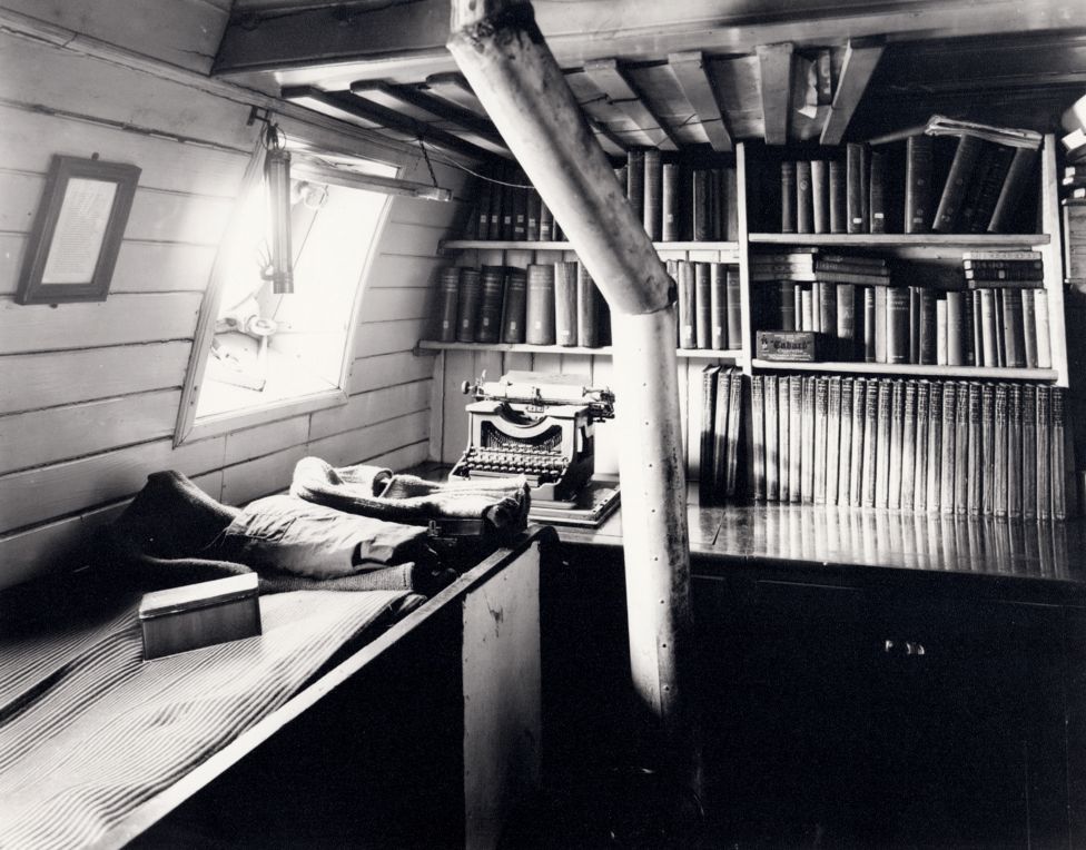
Black and white view of Shackleton's library on board the ship Endurance.
Sir Ernest Shackleton’s library on the Endurance. Source: bbc.com

Of course they couldn’t resist trying to identify the contents of the library. And it is only a matter of time before Shackleton’s collection is dutifully catalogued on LibraryThing.

Earlier this month, the same Royal Geographical Society was also hosting my friend and land-art artist Sylvain Meyer for the annual conference of the Society of Garden Designers. I’m very happy that Sylvain is getting recognized for his fantastic work! I also miss my print of his early piece Ondulation, which I loaned to another friend when I left Switzerland.

Photo of a land-art installation in the Swiss Alps. The earth has been manipulated to represent a set of concentric circles.
Ondulation by Sylvain Meyer

Making extravaganza

I’m currently clearing some backlog on my feed readers. Last week I went through the map folder, today it’s the one on making. A bunch of posts were about the insane Wintergatan musical marble machine that took the Internet by storm a couple of weeks ago. Here are some other projects that jumped at me:

The other night I lost an hour of my life making an origami Darth Vader by following this instructional video by Tadashi Mori. Here’s an origami X-Wing fighter to go with it.

IMG_7247

Finally, I like a good project timelapse as much as the next guy, but this one is particularly entertaining.

Link dump 2016/7: Maps

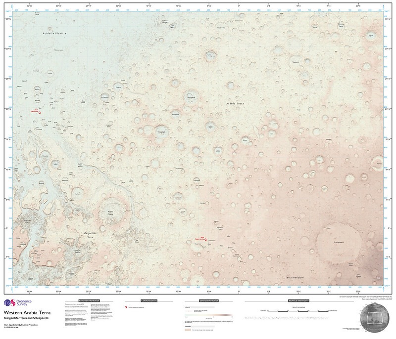
I spent some time this week updating the Maps section of my feed reader, and I was glad to learn that Jonathan Crowe’s Map Room was back on the, ahem, map. Some posts I found interesting: Redrawing the London Tube Map, Mapping Swiss German Dialects1, the Ordnance Survey map of Mars, the 1936 Japanese Rail Network, a map of Paris’ pneumatic tube network and a mention of Around Switzerland in 80 Maps, from my friends at Helvetiq!

Ordnance Survey map of Mars
Ordnance Survey map of Mars [on Flickr]
Crowe also links to Why Children Still Need to Read (and Draw) Maps [PBS], which reminded me I still need to find a good atlas I can share with my daughter. I gave her a map of Ontario for a camping trip we did last summer so she could keep track of our journey. I agree that learning to use (and appreciate) maps is still an important life skill.

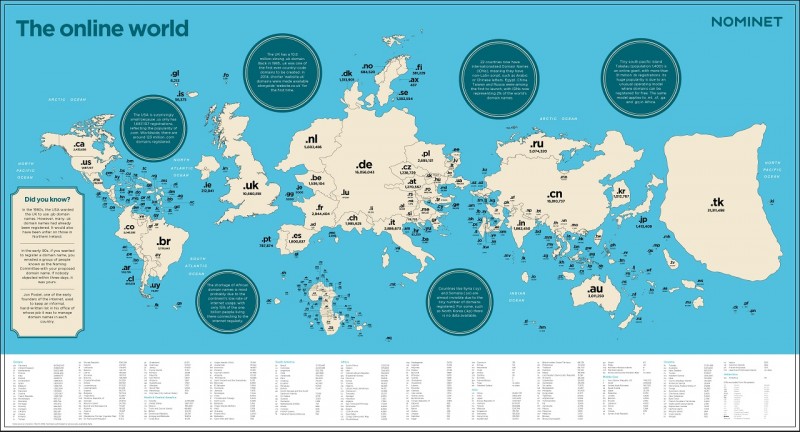
Further down in my inbox was this very interesting map of country TLDs, scaled by popularity, by way of the Strange Maps blog:

Map of the countries of the world, scaled according to the number of websites registered with their top level domains.
Map of the online world. Source: nominet.uk

Another good feed I subscribe to is Maps Mania, which unfortunately uses Feedburner to syndicate its content, with the result that only the briefest of snippets gets displayed in feed readers. This is not great for capturing the attention of the reader. I’m working on a way to use Huginn to create a nicer-looking feed, but I haven’t cracked the Feedburner nut yet. Anyways, here are a few posts that I found interesting: global flight connections map2, Rorschmaps and other Google Maps API hacks, mapping the word’s most boring (or interesting) roads by calculating how curvy they are, US Census name explorer and the UK surname map3.

All direct flight connections from Toronto's Pearson Airport.
All direct flight connections from Toronto’s Pearson Airport. Source: flightconnections.com

This heat map of public transit use in Toronto ties nicely with the everlasting debate on the city’s deficient transit infrastructure and the rampant cronyism that shapes it. It is encouraging to see some areas reach a healthy 50% of the population relying on public transit (which is not bad for a North American city). At the same time, one can’t help but see it as a map of income disparity, with well-connected wealthy neighbourhoods sticking to their cars, while many of those relying on public transit live nowhere near a mass transit line and probably don’t have much of a choice… Related: the Geography of Car Ownership in England and Wales and the visualization of rail station use in the UK.

Zipscribble maps aim to visualize how countries assign postal/zip codes. From the same source, the Travelling Presidential Candidate Map is a variant of the classic travelling salesman problem, computing the shortest path through all US ZIP codes.

Map of the USA showing the shortest line through all ZIP codes.
The Travelling Presidential Candidate Map. Source: eagereyes.org

Also one of my favourite visualizations from last year: the Isochrone maps of Europe by train. Also let’s not forget the Ultimate Crowdsourced Map of Punny Businesses in America.

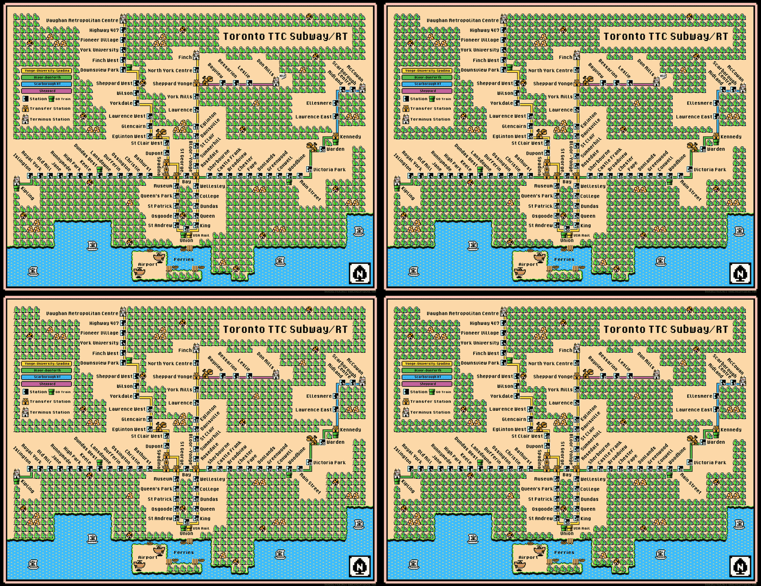
Update: How could I have missed the awesome Super Mario style TTC map:

Map of the Toronto subway and RT system, drawn in the style of the Super Mario video game.
Toronto TTC Subway/RT map, Super Mario style. Source: davesgeekyideas.com/

Note that this map already includes the Spadina line’s extension, scheduled to open at the end of 2017. Isn’t it interesting to note that many such fan-fiction versions of the TTC map4 include future or imaginary lines? Cartographic wishful thinking…

Update 2: And here’s a map of the Toronto subway with the approximate walking time between stations5:

Map of the Toronto subway, with walking times between stations.
Approximate walking times between TTC stations. Creator: Pavlo Kalyta.
  1. this reminds me of the Chuchichästli-Orakel, which places visitors on a map of Switzerland based on how they pronounce 10 words, with uncanny precision.
  2. A good candidate for a possible post on travel planning tools, I think.
  3. Reminding me that I’m still looking for a data source for my idea of trying to map Switzerland’s patronyms by popularity…
  4. Listing my favourites here would be another idea for a post.
  5. Ditto

Link dump 2016/5: Facebook colonialism, fake minimalism, SciHub and Foucault’s Pendulum

Link dump 2016/4: NoSQL, Mars littering, dams in disgrace and the lost pictures of Antarctica

Link dump 2016/2: Carnegie fireplaces, trains that could and Finnish light pillars

Link dump 2016/1: Modernist libraries, fiction publishing, podcasts and Noah Webster

While I keep working on the draft of my first actual blog posts, let’s see if I can also use this space to keep track of what I recently enjoyed reading:

This week, I also learned that most of American English spelling can be traced to Noah Webster. He axed the extra u’s in colour and neighbour, changed offence to offense and cheque to businesslike check. He’s the one who insisted the letter “z” be pronounced “zee” instead of “zed” (he also wanted “y” to be called “yi” and “w” to become “we”). All this, and much more, from the first chapter of Mary Norris‘ Between You & Me, which is a true delight to read1.

  1. Nonrestrictive clause